Prototyping
Context
During development of a new platform, naunced features and bespoke enhancements that hadn’t been attempted before were key to our success. Extensive prototyping and iterative design was required to make the launch and adoption a success.
Key Features
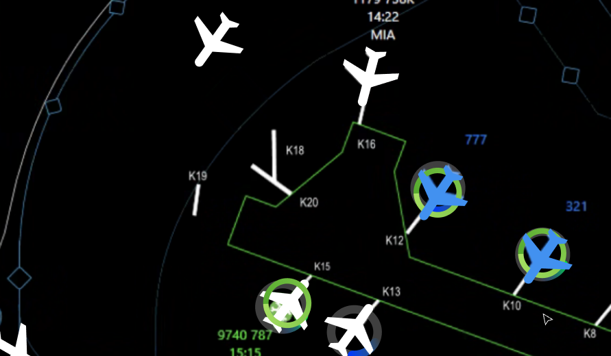
Live View Map, offering a real-time, bird's-eye view of assigned airports.
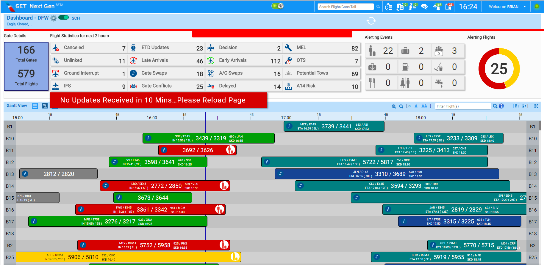
Gannt view
Plane selection to access detailed flight information.
Contextual graphics and animations to streamline information access.
Backwards compatibility with existing systems.
Shallow learning curve for easy onboarding and less training.
Part I:
A review before the redesign
Ah, let's dive into a heuristic review of this app, shall we? As a seasoned designer, I've had my fair share of experiences with apps that attempt to strike that delicate balance between user experience and functionality. Now, let's see how this one stacks up.
First things first, kudos to the team for creating an ambitious and capable app.
1. Visibility of Flight Status: Upon initial interaction, the app's ability to provide clear feedback about each flights current state and any ongoing processes is evident. No loading animations or progress indicators is a real problem however.
2. Match Between System and the Real World: The app's interface reflects familiar real-world concepts and terminology related to its functionality. It's like speaking the users' language, which goes a long way in preventing confusion and making the learning curve gentler.
3. User Control and Freedom: While initially seeming really straight forward, any tasks that go beyond visual confirmations, such as sending the flight crew a message aren’t very intuitive.
4. Consistency and Standards: The app does appear to have a cohesive design language throughout though some of the execution is not very consistent, making it feel at times unfinished.
5. Error Prevention: The app seems to have invested well in error prevention. The interface guides users towards making valid choices and avoids situations where errors might pop up.
6. Recognition Rather Than Recall: Basic functionality is intuitive and visually straightforward, however, for more nuanced tasks and information, it can be really difficult to find what you are looking for.
7. Aesthetic and Overall Design: The app's design is somewhat dated but not terrible, it seems as though it originally aimed to be minimalist but got caught up in scope creep. The focus on the essentials is evident, enhancing usability.
8. Help Users Recognize, Diagnose, and Recover from Errors: In terms of error handling, the app covers its bases with clear error messages and actionable solutions. Users aren't left scratching their heads – they're guided back on track.
9. Help and Documentation: The app's built-in help and tutorials are a saving grace. They provide support without being intrusive, catering to users seeking guidance without overwhelming those who are seasoned users.
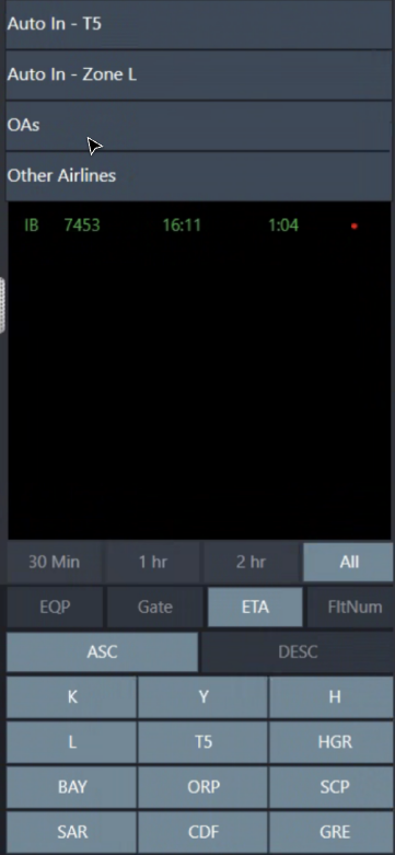
Scope creep can been seen in several places, most notably in the header and event manager.
The old UX ready for the revamp
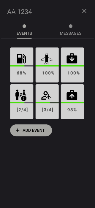
Flight and Event status is the star of the show
Part II: The Enhancements
Enhanced Microinteractions - Our focus on user-centric design led us to implement a series of finely-tuned microinteractions. These subtle yet impactful elements enhance clarity, provide valuable user feedback, and amplify the interface's ease of use and intuitiveness.
Night Mode Enhancement - Recognizing the application's predominant use in low-light environments, we incorporated a Night Mode feature, offering users the choice to alleviate eye strain.
Dynamic Alert Bar - Replacing the old busy alert bar was a big request. The new bar places alerts based on role and importance allowing the user to focus on what tasks are urgent.
Real-Time Live View - Beyond the existing list and gantt views, the newly introduced Live View empowers users to observe the current location and status of flights in real-time.
Puck Information Toggle - Introducing a Puck Info Toggle option, users can now effortlessly switch pucks into an information-rich state, facilitating swift comparison of multiple flights at a glance.
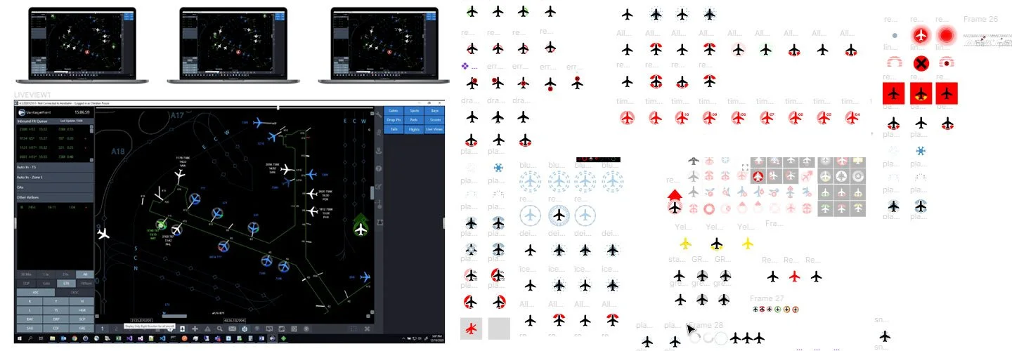
Deprecated live view assets
New and converted assets
Live Viemated proof of concept
Building a good foundation of assets allowed for more than just the efficient creation an app prototype with working features, prototypes of smaller proposed features, like the PPW (Plane Proximity Warning), were able to be previewed within days of proposing them.

Modular components
After simplifying and refining which messages were most important, base status graphics were selected to be used that could parent all other major status variants. Edge case and rare event graphics were also made.
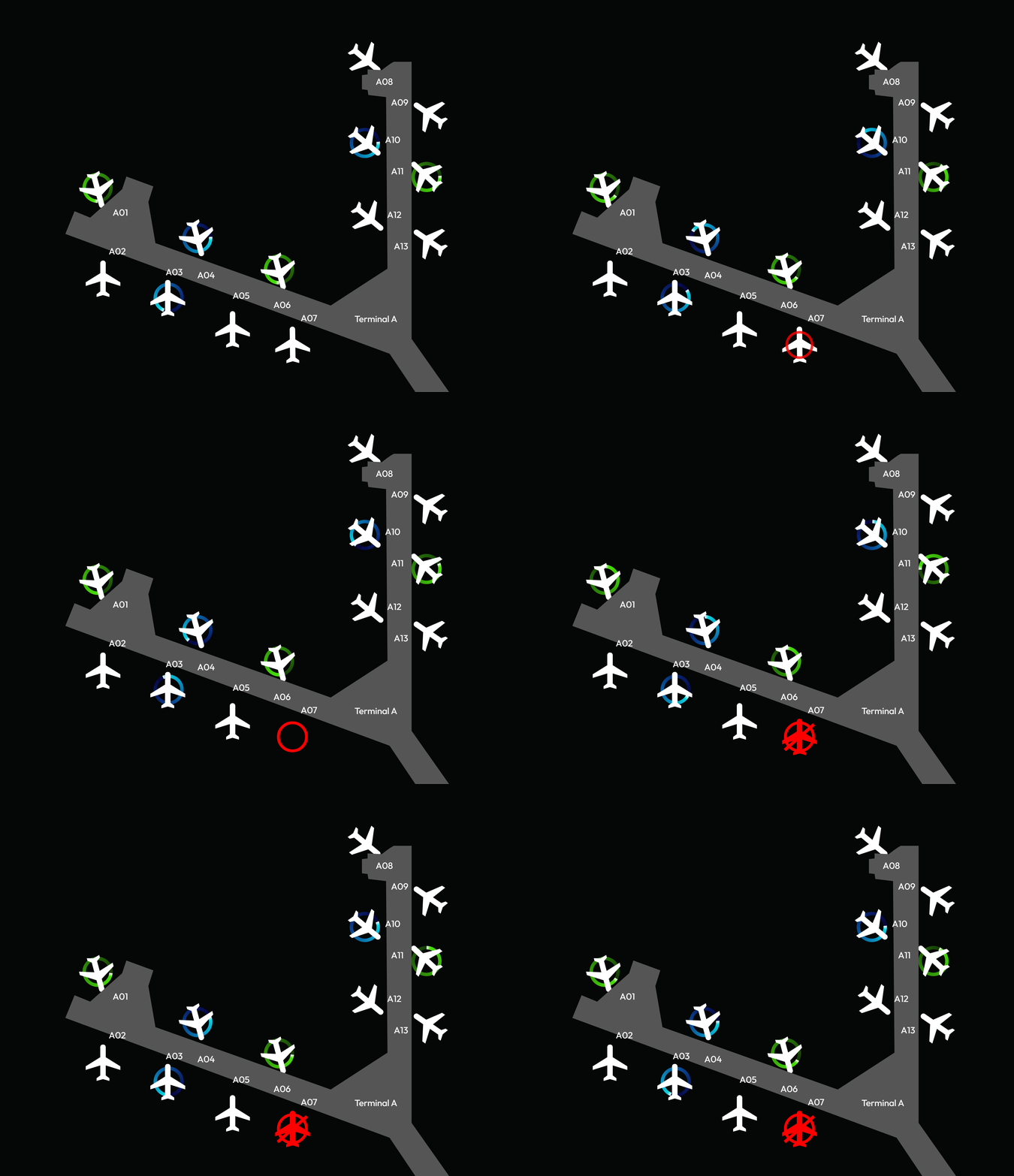
Icons with the circle indicate what service is alerting for that flight, 0n the bottom the red sides indicate proximity warnings for that aircraft.
Neutral, proximity warnings, in-progress and deicing statuses
Flights in green are ready to depart, blue are waiting for deicing, white are waiting, red indicates that the flight has been cancelled at the gate.
This initial prototype allowed the stakeholders to view almost all requested features very early into the project.
